Evaluation of Bias Correction
Below are descriptions of statistics implemented in bmorph for evaluating bias correction performance. Let P be predicted values, such as the corrected flows, and O be the observed values, such as reference flows.
Mean Bias Error (MBE)
Mean Bias Error is useful for preserving directionality of bias, yet may hide bias if both positive and negative bias exist in a dataset. MBE is therefore useful to determine how well biases balance out if you are only interested in the net or cumulative behavior of a system. This method is recommended against if looking to describe local changes without fine discretization to minimize biases canceling each other out.
Root Mean Square Error (RMSE)
Root Mean Square Error preserves magnitudes over directionality, unlike MBE.
Percent Bias (PB)
Percent Bias preserves direction like MBE, but aims to describe relative error instead of absolute error. PB is often used when analyzing performance across sites with different magnitudes. Because direction is preserved, the issue of positive and negative biases canceling out arises again here like in MBE.
Kullback-Leibler Divergence (KL Divergence)
Kullback-Leibler Divergence, or relative entropy, is used to describe how similar predicted and observation distributions are. Taken from Information Theory, KL Divergence describes the error in using one probability distribution in place of another, turning out to be a strong statistic to analyze how bmorph corrects probability distributions of stream flows. A KL Divergence value of 0 symbolizes a perfect match between the two probability distributions, or no error in assuming the one distribution in place of the other.
Kling-Gupta Efficiency (KGE)
The Kling-Gupta Efficiency compares predicted flows to observed flows by combining linear correlations, flow variability, and bias (Knoben et. al. 2019). A KGE value of 1 represents predicted flows matching observed flows perfectly.
Plotting
The Evaluation package of bmorph comes with a number of plotting tools to analyze bias correction performance.
Whether you want to compare corrected to uncorrected values, contrast different bias correction parameters, or simply compile your results into a tidy plot across multiple sites, there are plenty of plotting functions to choose from.
You can find plotting functions here.
The following plots are created from the results produced by the tutorial, where yakima_ds is yakima_data_processed.nc from the sample data before using any of the code provided below, make certain to import plotting like so:
from bmorph.evaluation import plotting
Scatter
plotting.compare_correction_scatter(
    flow_dataset= yakima_ds,
    plot_sites = ['KIOW','YUMW','BUM'],
    raw_var = 'raw',
    ref_var = 'ref',
    bc_vars = ['scbc_c'],
    bc_names = ['SCBC_C'],
    plot_colors = list(colors[-1]),
    pos_cone_guide = True,
    neg_cone_guide = True,
    symmetry = False,
    title = '',
    fontsize_legend = 120,
    alpha = 0.3
)
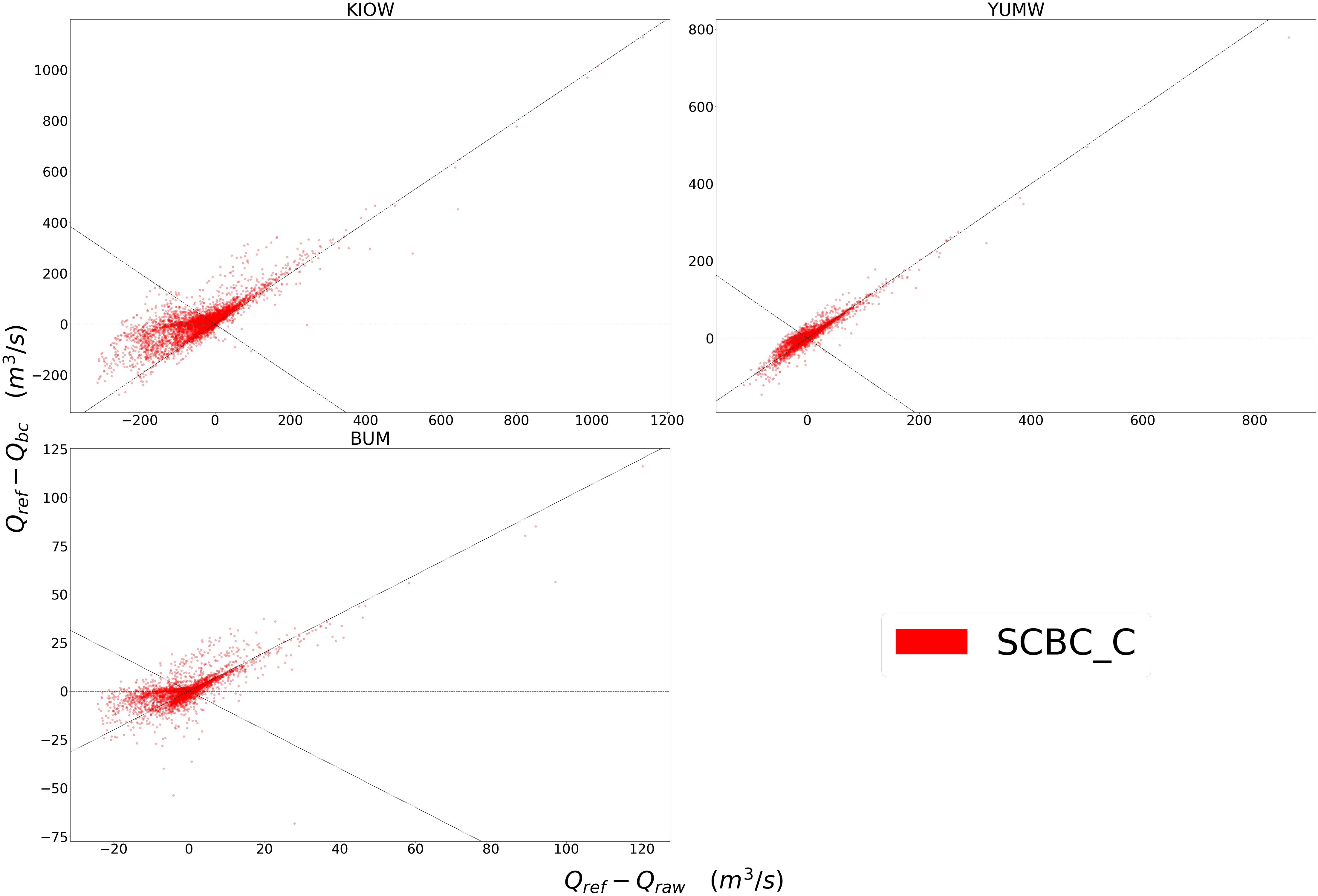
Scatter plots are most useful for comparing absolute error before and after bias correction. The above plot is produced from bmorph.evaluation.plotting.compare_correction_scatter to compare how absolute error changes with SCBC_C bias correction with Q being stream discharge. 1 to 1 and -1 to 1 lines are plotted for reference, as points plotted vertically between the lines demonstrates a reduction in absolute error while points plotted horizontally between the lines demonstrates an increase in absolute error for each flow time.
Time Series
plotting.plot_reduced_flows(
    flow_dataset= yakima_ds,
    plot_sites = ['KIOW','YUMW','BUM','KEE'],
    interval = 'week',
    raw_var = 'raw', raw_name = "Uncorrected",
    ref_var = 'ref', ref_name = "Reference",
    bc_vars = ['scbc_c'], bc_names = ['SCBC_C'],
    plot_colors = ['grey', 'black', 'red']
);
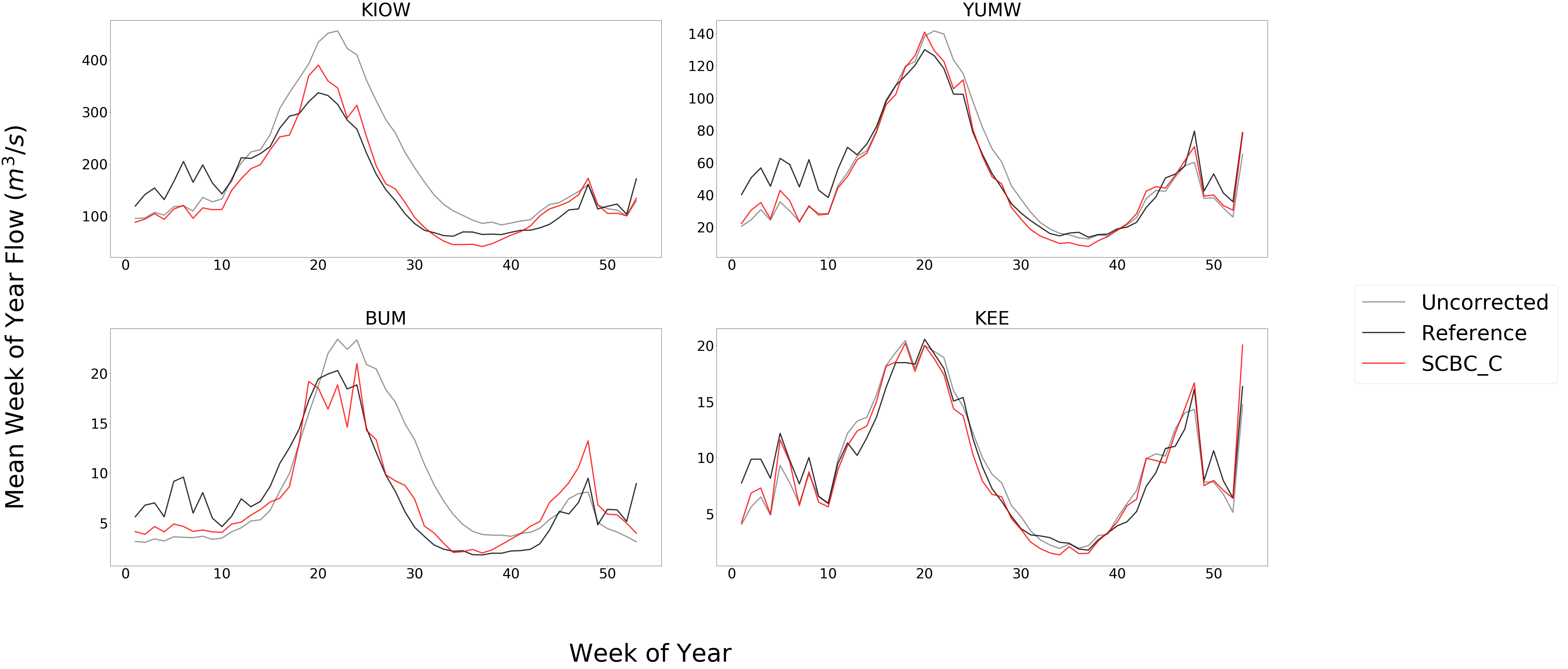
The above plot is produced from bmorph.evaluation.plotting.plot_reduced_flows to compare a statistical representation of the flows at each site, (Mean in this case), for raw, reference, and bias corrected flows according to SCBC_C. Here, averages are computed on weekly intervals to simplify the figure, but can also be plotted on daily or monthly intervals for more or less granularity. Comparing this with median flows can describe how much the mean is impacted by extreme flows.
Probability Distributions
plotting.compare_mean_grouped_CPD(
    flow_dataset= yakima_ds,
    plot_sites = ['KIOW','YUMW','BUM'],
    grouper_func = plotting.calc_water_year,
    figsize = (60,40),
    raw_var = 'raw', raw_name = 'Uncorrected',
    ref_var = 'ref', ref_name = 'Reference',
    bc_vars = ['scbc_c'], bc_names = ['SCBC_C'],
    plot_colors = ['grey', 'black', 'red'],
    linestyles = ['-','-','-'],
    markers = ['o', 'X', 'o'],
    fontsize_legend = 90,
    legend_bbox_to_anchor = (1.9,1.0)
);
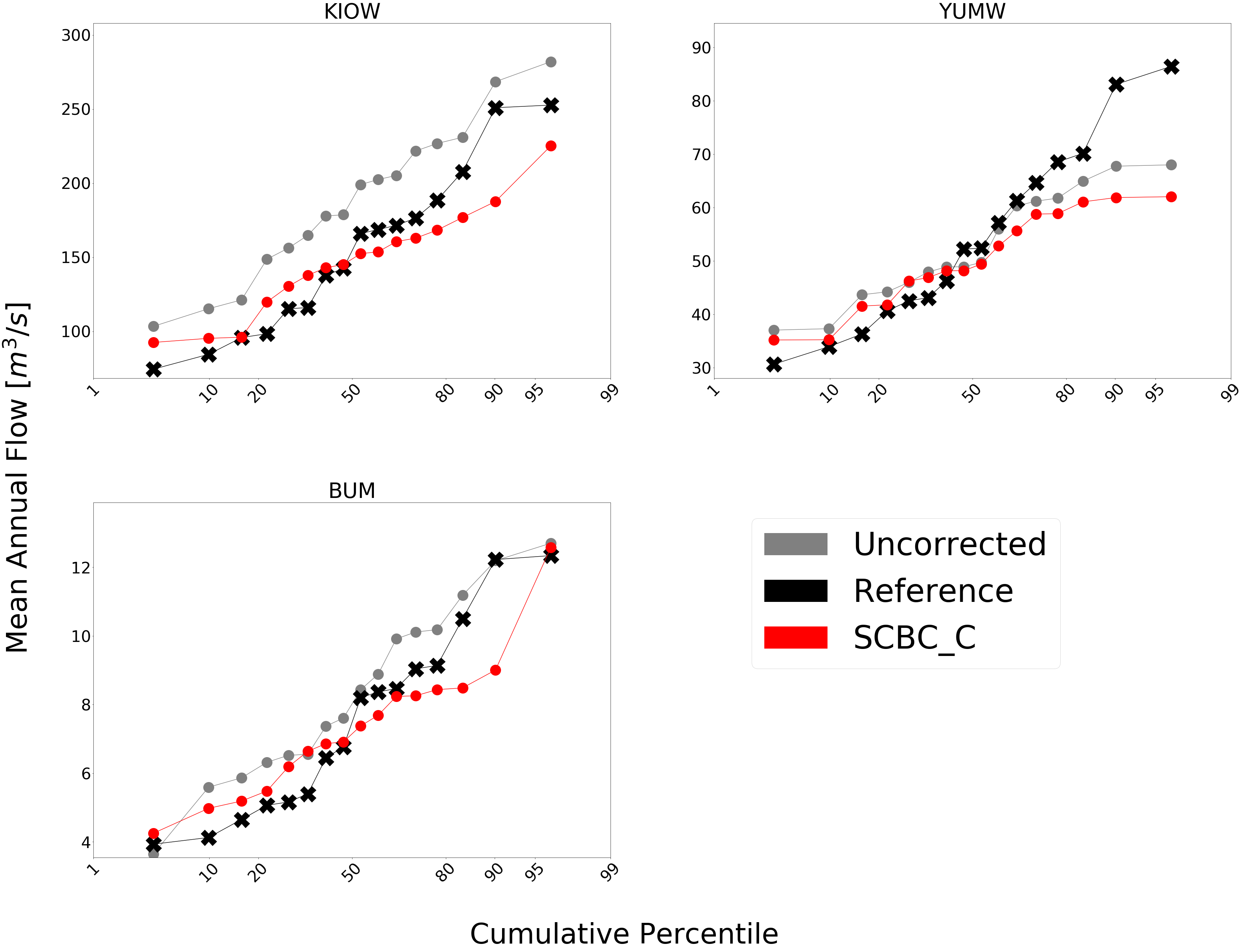
The above plot is produced from bmorph.evaluation.plotting.compare_mean_grouped_CPD to compare cumulative percentile distributions of mean annual flow at each site for raw, reference, and bias corrected flows according to SCBC_C. This function is also capable of subsetting data by month should you want to compare only January flows for example. Because bmorph makes changes based on flow distributions, this plot is the closest to directly analyzing how the different methods correct flows.
Box & Whisker
plotting.kl_divergence_annual_compare(
    flow_dataset= yakima_ds,
    sites = ['KIOW','YUMW','BUM'],
    fontsize_legend = 60, title = '',
    raw_var = 'raw', raw_name = 'Uncorrected',
    ref_var = 'ref', ref_name = 'Reference',
    bc_vars = ['scbc_c'], bc_names = ['SCBC_C'],
    plot_colors = ['grey','red']
);
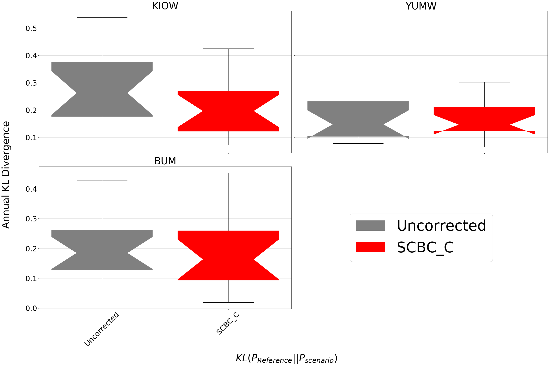
The above plot is produced from bmorph.evaluation.plotting.kl_divergence_annual_compare to compare KL Divergence with respect to reference flows for raw and SCBC_C. Being able to view KL Divergence for different scenarios side-by-side helps to provide a better understanding of how well probability distributions are being fitted across the entire time provided.
Citations
Knoben, W. J. M., Freer, J. E., & Woods, R. A. (2019). Technical note: Inherent benchmark or not? Comparing Nash-Sutcliffe and Kling-Gupta efficiency scores. Hydrology and Earth System Sciences, 23, 4323-4331. https://doi.org/10.5194/hess-23-4323-2019